Skip to content
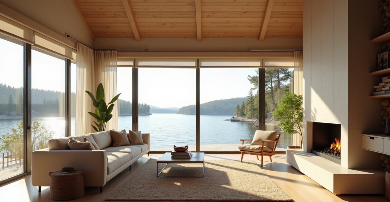
Waterfront bedrooms feel wrong fast when the paint is too stark, too saturated, or too trendy. The best lake house bedroom color palettes do the opposite: they quiet the room, soften morning light, and make wood, linen, and daylight work together instead of competing.
In practice, the winning formula is not complicated. Start with a gentle neutral base, add one muted water-inspired color, and finish with warm textures so the room still feels lived in. That balance matters more than chasing a “perfect” blue, because a bedroom by the lake should feel calm at dawn, clean at noon, and warm at night.
What You Need to Know
- A lake house bedroom usually looks best with low-contrast colors, because bright contrast can feel harsh in reflected daylight.
- Soft white, oatmeal, fog gray, muted blue, and sage are the most reliable foundation colors for a restful room.
- The right palette depends on light direction, trim color, wood tone, and whether the room faces open water or shaded trees.
- Texture matters as much as paint: linen, rattan, washed cotton, and oak keep cool colors from feeling sterile.
- Test large swatches in morning and evening light, because lake light changes faster than people expect.
Lake House Bedroom Color Palettes That Feel Calm, Airy, and Finished
Technically, a color palette is the complete set of hues, values, and undertones used across a room. In plain English, it is the color story: walls, trim, bedding, rug, curtains, and accents all speaking the same language. For a lake house bedroom, that story usually works best when the value range stays soft and the undertones lean natural rather than icy.
Here’s the part many people miss: a lake setting already gives you strong visual interest. Water, sky, tree line, and changing light do a lot of the design work for free. That is why overly decorated palettes can feel busy instead of relaxing. The room does not need more drama; it needs more breathing room.
The most successful lake house bedrooms do not use the brightest blue in the room; they use the quietest blue that still reads clearly in daylight.
If you want a room that looks polished instead of themed, keep the palette anchored in one of three directions: soft warm neutral, misty cool neutral, or a blue-green blend with low saturation. Those families hold up across seasons and do not fight the natural light that comes through windows near water.
How Water, Light, and View Change the Palette
Lake homes are tricky because the light shifts in ways suburban rooms often do not. Open water can throw extra brightness into the room, while tree cover can make a bedroom feel cooler and darker. That means the same paint can look crisp in one lake house and muddy in another.
Why Undertone Matters More Than Color Name
A paint labeled “white,” “gray,” or “blue” tells you very little on its own. What matters is the undertone: yellow, pink, green, blue, or violet influence how the color behaves next to wood floors, stone, and bedding. A blue with a green undertone often feels more relaxed near water than a blue that leans violet, which can read colder under morning light.
Architectural color advice from university design programs and daylighting research often points to the same idea: color perception changes with illumination, surface reflectance, and neighboring materials. For a useful primer on how light affects color reading, Penn State Extension’s guidance on color and light is worth a look.
When Cool Colors Stop Feeling Cold
Cool colors can feel beautifully restful in a bedroom, but they need a warm counterweight. Without wood grain, natural fiber, or a warmer white, a pale blue room can drift into hotel-lobby territory. That is why a room with oak nightstands, flax-colored bedding, and brushed brass hardware usually feels more inviting than one built from paint alone.
If a bedroom faces bright water, the safest move is a softer wall color than you think you need, then warmer textiles than you think you need.

Best Base Neutrals for Walls, Trim, and Bedding
Base neutrals do the heavy lifting in a lake house bedroom. They set the temperature of the room, control how much visual noise you allow, and determine whether accent colors feel serene or scattered.
Soft White
Soft white is the easiest starting point when the room already has good light. It works especially well with beadboard, paneled walls, or simple trim because it keeps the architecture visible without making the room feel stark. Look for whites that carry a touch of cream, bone, or linen rather than a sharp blue cast.
Oatmeal and Sand
Oatmeal is one of the most underrated colors for a lakeside bedroom. It bridges cool daylight and warm wood tones, which makes it forgiving when the room has pine ceilings, whitewashed floors, or a mix of old and new furniture. Sand shades do the same job, just a little sunnier.
Fog Gray and Pebble
Fog gray can be excellent in a north-facing room or one with soft filtered light from trees. The trick is to choose a gray that still feels warm enough to support bedding and curtains. Pebble tones are useful when you want something more tailored than beige but less cool than slate.
For those comparing neutral families, recent home design trend reporting from the National Association of Home Builders shows that warm neutrals and natural materials continue to dominate residential interiors. That tracks with what works in lake houses: the setting already supplies color, so the room benefits from restraint.
| Neutral | Best Use | Watch Out For |
|---|---|---|
| Soft White | Small or bright bedrooms | Can look icy if the undertone is too blue |
| Oatmeal | Rooms with wood furniture or trim | Can feel flat without texture |
| Fog Gray | Shaded rooms or modern cabins | May read cold beside cool-toned flooring |
| Pebble | Layered, polished spaces | Needs warm accents to avoid looking dusty |
Muted Blues, Greens, and Grays That Fit the Waterfront
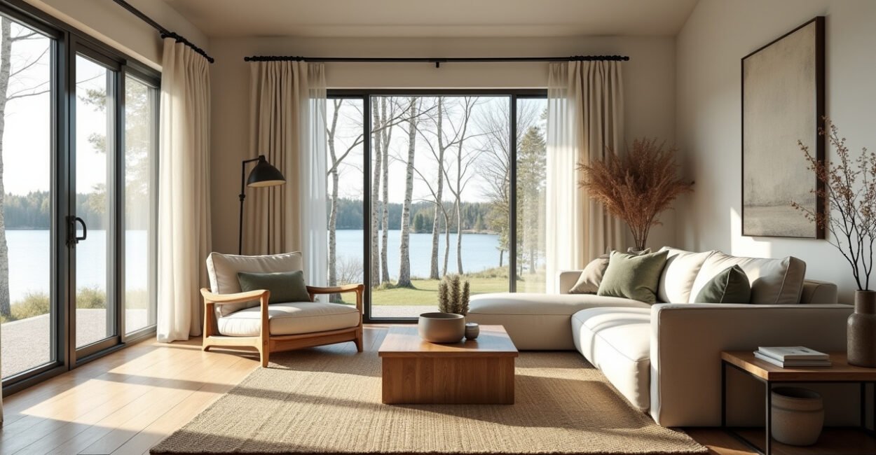
This is where most people go first, and for good reason. Water-inspired color can make a bedroom feel tied to the setting without turning it into a seaside cliché. The safest versions are muted, slightly grayed, and never overly bright.
Mist Blue
Mist blue works when you want the room to feel open and fresh. It pairs well with white oak, shell-colored bedding, and simple white trim. If the room already gets a lot of reflection from the water, keep this color very soft; otherwise, it can start to dominate.
Sage and Eucalyptus
Sage is one of the most flexible colors in a lake house bedroom because it bridges land and water. It feels natural next to wicker, aged brass, and warm wood. Eucalyptus shades are a little clearer and can look beautiful in rooms with leafy views, but they need a gentle white nearby to stay relaxed.
Blue-Gray and Slate Mist
Blue-gray is the most tailored version of a lake palette. It feels more structured than sage and usually works well in rooms with clean-lined furniture. Slate mist, however, can go too heavy if the bedroom is small or if the ceiling is low. That is one place where the rule breaks: darker cool tones can be elegant, but only when the room has enough daylight and enough contrast from the floor.
Who works with interiors every day knows that the “pretty swatch” test fails more often than people expect. I have seen a color look perfect on the sample card and turn oddly green once it sat next to a warm pine dresser and a wool rug. That is why the sample has to live in the real room, not on a countertop under kitchen lighting.
Warm Textures That Keep Cool Colors from Feeling Sterile
Paint sets the direction, but texture makes the room believable. A lake house bedroom usually needs at least three warm tactile notes so the palette does not feel flat: one in wood, one in fabric, and one in a natural accessory or rug.
Wood Tones That Help More Than People Think
Oak, ash, walnut, and weathered pine each change the mood of the room in a different way. Oak reads easy and classic, walnut adds depth, ash feels lighter and cleaner, and weathered pine brings a relaxed cottage feel. If the room has cool walls, a honeyed or mid-tone wood usually creates the best balance.
Textiles That Add Quiet Warmth
Linen drapes, washed cotton quilts, chunky throws, and wool rugs prevent the room from feeling overfinished. They also soften echoes, which matters in rooms with hard flooring and high ceilings. A simple trick: if the palette starts feeling too crisp, add one nubby or brushed textile before changing the paint.
Hardware, Lamps, and Small Details
Matte black can work, but brass, aged nickel, and oil-rubbed bronze often feel calmer in a lake house bedroom. These finishes add definition without shouting. Lampshades in paper, linen, or textured cotton also help diffuse light at night, which is when a cool color palette needs the most support.
The difference between a serene lake bedroom and a cold one is rarely the paint alone; it is the ratio of matte, natural, and softly reflective surfaces.
Mini-story: A client once wanted a crisp white-blue bedroom because the view from the bed faced the water. On the sample board, it looked beautiful. In the room, though, the white turned harsh against the pine floor and the blue got louder every afternoon. We shifted to a warmer white, added flax bedding, and swapped one navy accent pillow for sage. The room kept the same idea, but it finally felt like a place to sleep.
Three Proven Palette Directions for Different Lake House Styles
There is no single “correct” palette, and that is where a lot of advice gets fuzzy. A modern lake house, a classic cabin, and a cottage-style retreat need different levels of contrast and warmth. The style of the architecture should guide the color decisions, not the other way around.
| Style | Recommended Palette | Why It Works |
|---|---|---|
| Modern Lake House | Soft white, blue-gray, ash wood, black accents | Feels clean and tailored without becoming stark |
| Classic Cabin | Oatmeal, sage, weathered pine, brass | Respects the warmth of natural materials |
| Cottage Retreat | Warm white, mist blue, linen, rattan | Keeps the room airy and easygoing |
Modern Lake House
Go lighter on the walls and more architectural with the details. This style benefits from crisp lines, restrained color, and a few stronger anchors like black-framed art or a darker bench. Keep the blue muted so the room feels refined, not nautical.
Classic Cabin
This is where warm neutrals shine. The palette should respect wood structure instead of trying to override it. If the bedroom has knotty pine or a timber ceiling, a color that is too bright will fight the room. Let the material richness carry the look.
Cottage Retreat
Here, the room can be softer and more relaxed. Cottage bedrooms often do best with gentle whites, pale blues, and woven textures. The goal is charm without clutter, which means keeping patterns limited and repeating the same undertone across the bedding and wall color.
How to Test Paint Before You Commit
Paint samples are not optional in a lake house. They are the whole decision. Light on the water changes color by the hour, and a swatch that looks perfect at 10 a.m. can feel completely different by late afternoon.
Use Large Samples, Not Tiny Chips
Paint at least two large boards or big swatches directly on the wall. Move them around the room so you can see how they read near the window, beside the bed, and across from the trim. Small chips lie because they do not show the full effect of undertone and reflectance.
Check Morning, Noon, and Evening Light
Morning light is often cool and directional. Midday can be brighter and more revealing. Evening usually softens the whole palette and may make certain grays or blues feel flatter. The best choice is one that still looks calm at all three times, not just the time you happen to visit the room.
For color reading, even the U.S. government’s information on light and visibility reminds us that illumination changes perception more than people assume; see the NASA materials on light and visual observation for a broader understanding of how light alters what the eye perceives. That sounds academic, but the practical takeaway is simple: test paint where you actually live, not under ideal conditions.
What to Choose When the Room Feels Too Blue or Too Beige
Most decorating mistakes in lake bedrooms are not dramatic. They are almost-right choices that lean too far in one direction. A room becomes chilly when the blue is too clean, and it becomes sleepy in the wrong way when the beige has no contrast or clarity.
If the room feels too blue: add warmer white bedding, a natural fiber rug, or a wood bedside table with visible grain. If the room feels too beige: introduce a muted blue-green through pillows, art, or a throw, not a second beige. The smartest palettes use contrast in tone, not contrast in loudness.
This method works well in bedrooms, but it can fail in spaces with extremely dark wood, very low ceilings, or aggressive green outside light. In those cases, you may need a richer neutral or a more controlled white to keep the room from feeling washed out.
O Que Fazer Agora
Choose one direction first: warm neutral, misty cool neutral, or muted blue-green. Then build the room around that choice with a single wall color, one bedding family, and one wood tone that repeats at least twice. If you are comparing options, shortlist three palettes, test them in the real room for 48 hours, and pick the one that still feels calm when the light changes.
Can a Lake House Bedroom Use Dark Colors?
Yes, but only when the room has enough daylight and enough reflective balance from trim, bedding, or windows. Deep navy, charcoal, and forest green can feel elegant in a lake house bedroom, especially in larger rooms with tall ceilings. The risk is heaviness: dark colors absorb light fast, so they work best as accents or in bedrooms that already get bright morning sun.
Are White Lake House Bedrooms a Bad Idea?
No. A white bedroom can look beautiful near water, but the white has to be soft, not stark. The best versions usually lean cream, linen, or warm chalk rather than a cool builder-grade white. Pairing that white with wood, woven shades, and textured bedding keeps the room from feeling empty or clinical.
What Colors Should I Avoid in a Lake House Bedroom?
Avoid overly saturated colors, icy whites, and grays with a strong purple cast unless you know the room light can handle them. Bright aqua, neon blue, and high-contrast black-and-white schemes often feel louder than the setting wants. The biggest issue is not taste; it is glare, reflection, and visual fatigue in a room meant for rest.
How Do I Make a Blue Bedroom Feel Warm Enough for Sleeping?
Use blue on the walls or in accents, then layer in warm natural materials. Linen curtains, oak furniture, a wool rug, and cream bedding make a blue room feel inviting instead of cool. If the blue is already strong, soften it with lower-contrast patterns and warm metal finishes like brass or aged nickel.
What is the Easiest Palette to Get Right the First Time?
A warm white base with muted blue-green accents is usually the safest starting point. It gives you flexibility, works with most lake views, and stays calm across changing light. If you want the lowest-risk setup, keep the walls quiet, let the bedding carry the color, and repeat one wood tone in multiple places.