Skip to content
Sunlight hitting the wrong wall can feel wasted. Swap one coat of paint and the room snaps awake. This article shows specific light color palettes and paint pairings that amplify daylight—what neutrals reflect best, which accent hues bounce light, and which finishes actually help, room by room. You’ll get quick, practical picks plus a few surprising rules no decorator tells you.
Why a Single Neutral Can Change How Much Light a Room Feels Like
Not all neutrals reflect light the same. A warm beige with subtle yellow undertones will make a north-facing room feel brighter than a “cool” gray with blue undertones. Light color palettes matter because they interact with the sun’s angle and the existing surfaces in your room. Think of paint as a mirror with mood—some neutrals throw back warmth, others look flat. Test a 3×3 foot swatch in direct sunlight before you commit. For technical reference on light and building performance, see resources from U.S. Department of Energy.
The Accent Colors That Actually Boost Daylight (yes, Even Bold Ones)
Bright accents can amplify perceived light when used right. A small sunlit wall painted in soft lemon or pale coral will reflect warm light deeper into the room. Use accents in measured doses: one wall, the back of open shelving, or the underside of a window seat. A saturated navy or forest green can make light pop by contrast, but only if surrounding walls are in light color palettes that reflect. The trick: accents need a reflective stage—matte accent on a glossy backdrop = lost potential.

Finishes That Reflect: When to Choose Matte, Eggshell, Satin, or Gloss
Finish choice changes perceived brightness as much as color. High gloss and semi-gloss reflect more direct light but also show texture and imperfections. Eggshell and satin hit the sweet spot in living spaces—enough reflection to lift a room without glare. Use gloss sparingly: trim, window sills, and doors. In bathrooms and kitchens choose finishes that resist moisture and bounce light. If you want numbers, look up light reflectance and building guides from Harvard studies on light in built environments.
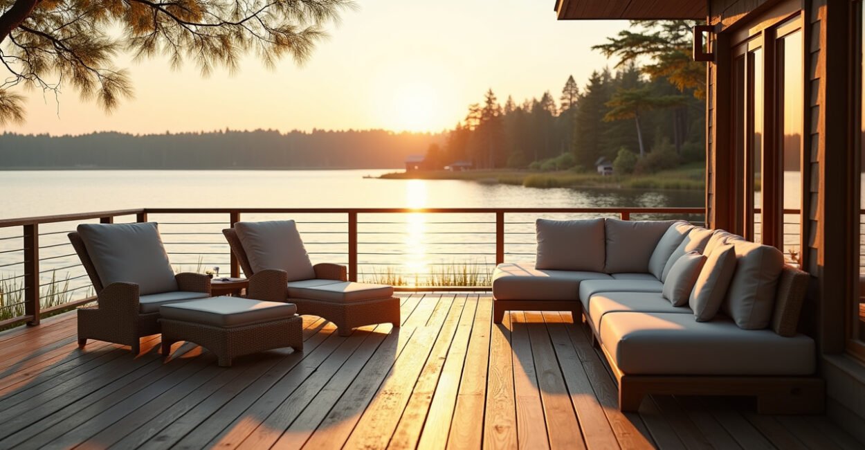
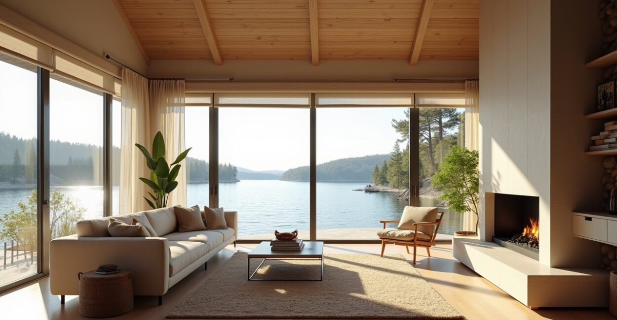
Room-by-room Pairings That Brighten Instantly
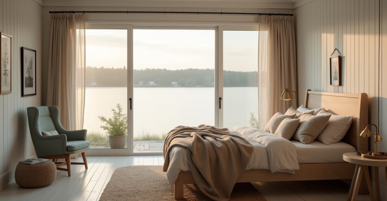
Different rooms ask for different light strategies. For north-facing bedrooms, pair a cool warm white (around 2700–3000K feel) with warm beige trim to add warmth. South-facing living rooms can wear cooler grays with bright lemon accents to balance heat. Kitchens love crisp, cool whites with satin finishes that bounce task light. Hallways benefit from a slightly warmer neutral and a satin ceiling—this pulls light downward. Each suggestion uses tested light color palettes to make rooms read brighter immediately.

Before/after: One Surprising Comparison That Proves the Rule
One coat, two moods. I once saw a windowless office painted from mid-gray to a pale warm cream. Expectation: subtle improvement. Reality: the room looked 30% brighter, people reported feeling less tired. That comparison isn’t mystical—light color palettes change how surfaces reflect light, altering contrast and shadow. The same lamp will throw more useful light in a well-chosen palette. Small changes in hue or finish can create a disproportionate visual lift.
Common Mistakes to Avoid When Choosing Light Color Palettes
Stop making these paint blunders.
- Choosing “white” straight from the swatch without testing—many whites have blue, green, or pink undertones.
- Using the same finish everywhere—high gloss in textured walls amplifies flaws.
- Ignoring window orientation—north light looks different than south light.
- Relying solely on photos—camera processing hides real reflections.
These errors undo the benefits of light color palettes fast. Test, observe at different times of day, and pair colors with finishes for real gains.
A Small Story That Shows How to Apply These Palettes in Real Life
Three coats, one ceiling, and a big change. A friend moved into a basement apartment with low light. We chose a warm off-white for walls, a satin finish on the ceiling, and pale aqua on the trim. We painted the inside faces of shelves a bright cream. After two days, the apartment felt open and calm—visitors asked if larger windows had been installed. The palette and finishes did the heavy lifting; no structural work required.
If you want a quick action list: pick a neutral with the right undertone for your light, add a reflective satin or eggshell, and place one bright accent where sun hits. That combination will make the biggest, fastest difference.
Closing Thought: A Practical Dare
Try this: pick one wall that gets morning or afternoon sun. Paint a large swatch of your chosen light color palette and observe for three days. If the room doesn’t feel brighter, tweak undertone or finish. It’s cheap, reversible, and the payoff is immediate. Light is the easiest renovation you haven’t tried.
Which Neutral Undertone Should I Choose for a North-facing Room?
Choose warm undertones for north-facing rooms. North light is cool and indirect, so a neutral with subtle yellow, peach, or warm beige undertones will balance that coolness and make the room read brighter and cozier. Test a 3×3 foot swatch near the window and observe at morning and late afternoon. If the swatch looks washed out or too blue, move toward a warmer undertone. A warm neutral plus satin finish often gives the best perceived increase in daylight without glare.
Can Dark Colors Ever Make a Room Feel Brighter?
Yes—when used strategically. Dark colors increase perceived brightness by raising contrast. A deep accent wall opposite a window can make the lighter surfaces appear brighter by comparison. Use this sparingly: surround the dark accent with reflective light color palettes and avoid using dark hues on large surfaces in low-light rooms. Placement matters more than shade. In well-lit rooms, dark colors add depth while still allowing natural light to pop off lighter surfaces.
What Finish Should I Choose for Ceilings to Maximize Daylight?
Ceilings painted in a light color with a flat to eggshell finish usually work best. Flat paints hide texture but reflect less light. Eggshell on the ceiling gives a subtle lift without glare and helps bounce light back down. If your ceiling is smooth and you want extra bounce, satin is acceptable for small rooms. Avoid high gloss across large ceilings—it can create uneven glare and highlight imperfections rather than increase usable daylight.
How Do I Test Paint Samples to Choose the Right Light Color Palette?
Paint large swatches (at least 3×3 feet) on different walls and view them across the day—morning, midday, evening. Look at samples beside your furniture and flooring; colors interact. Use a mix of finishes on test strips to judge reflection. Take photos with your phone for reference, but trust your eyes more than images. If possible, buy sample pots and paint a full wall section; small chips on a card won’t show undertones or how the finish behaves in real light.
Are There Quick Pairings for Kitchens to Make Them Feel Brighter Now?
Pick a high-reflectance light for cabinets—soft white or very pale gray—and use satin or semi-gloss for easy cleaning and light bounce. Pair cabinets with a slightly warmer wall neutral to prevent a clinical look. Add a glossy backsplash or light-reflective tile behind cooking areas to push light outward. Under-cabinet lighting plus these light color palettes makes countertops read brighter. Small metallic accents in fixtures also help scatter light across surfaces for an immediate brightening effect.