 Skip to content
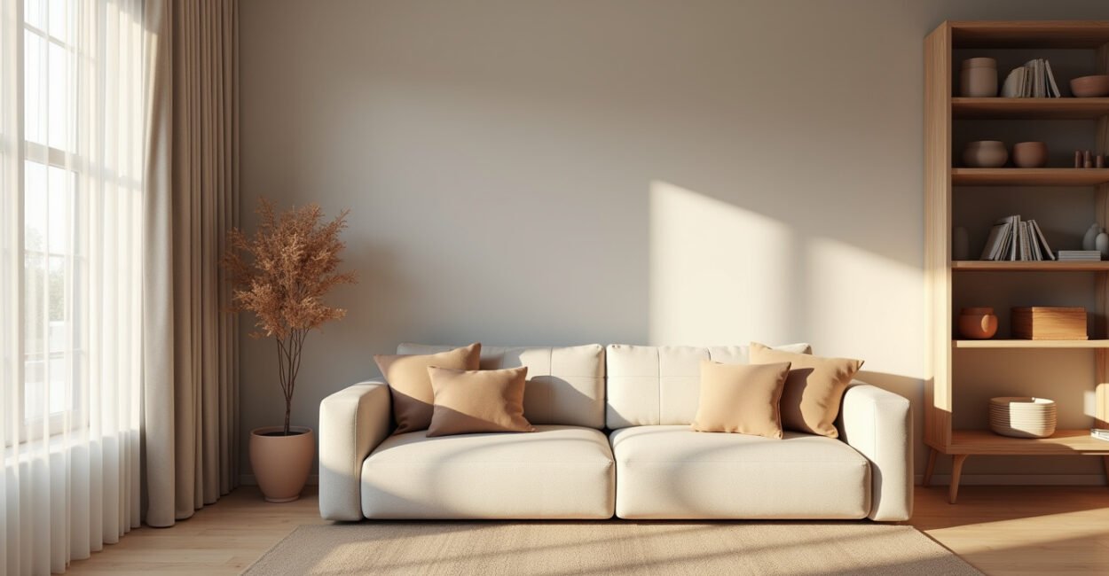
In a small apartment, the right neutral colors can do more than “play it safe.” They can make the room feel wider, brighter, and oddly calmer.
The trick is not picking white and calling it done. It’s choosing the right neutral shades, in the right balance, so your walls, textiles, and furniture work like one quiet system instead of a pile of separate pieces.
Why Neutral Colors Make Small Apartments Feel Bigger
Technically, neutral colors are low-saturation hues: whites, creams, taupes, greiges, soft beiges, muted clay tones, and pale warm grays. In plain English, they’re colors that don’t shout. They let light move around the room instead of getting trapped by dark visual weight.
That’s why a small apartment can feel larger with neutrals even when the square footage hasn’t changed. Light bounces more cleanly off soft, matte walls. Large surfaces read as one continuous field. Your eye stops “breaking” the room into chunks.
Here’s the part people miss: not all neutrals behave the same. A cool gray with blue undertones can make a north-facing room feel crisp but a little severe. A warm ivory can soften hard edges and reflect light in a friendlier way. In practice, the best choice depends on the apartment’s light, floor color, and the temperature of the fixtures you already have.
That’s the reason two apartments can both be “neutral” and still feel totally different. One feels airy. The other feels flat. The difference is undertone.
The 3 Neutral Palettes That Usually Work Best
If you want a cohesive look without making the space feel sterile, start with one of these neutral color palettes.
- Warm white + sand + oatmeal: great for low-light rooms that need softness.
- Greige + stone + soft black accents: ideal if you want a modern, calm look with more contrast.
- Cream + taupe + muted olive or clay: best when you want warmth without drifting into yellow.
What makes these combinations work is restraint. You’re not trying to decorate with 12 competing shades. You’re building a tonal range. Walls can stay the lightest. Softer neutrals can cover rugs, bedding, and curtains. Slightly deeper neutrals can ground the sofa, headboard, or dining chairs.
The shortest path to a polished apartment is not more color. It’s better color control. One warm neutral on the walls, one deeper neutral for contrast, one accent material like wood or linen, and the whole room starts to feel intentional.

The Mistake That Makes Neutrals Look Dull Instead of Elevated
The biggest mistake is using one flat neutral everywhere. Same beige wall, same beige sofa, same beige curtains, same beige rug. That doesn’t feel airy. It feels like the room lost its pulse.
In a small apartment, variation matters more than volume. You need contrast in texture and depth, not loud color. Think plaster next to cotton, oak next to linen, matte paint next to a slightly glossy ceramic lamp. Those differences keep neutral colors alive.
Here’s a quick before-and-after image:
Before: one pale beige repeated across every surface, with nothing to catch the eye.
After: a warm white wall, a taupe sofa, natural wood legs, and a cream curtain that glows when daylight hits it.
The second room feels bigger, even if the furniture footprint is identical. Why? Because the eye can move. The room has rhythm.
And if your apartment gets only one or two hours of daylight, this matters even more. The wrong flat neutral can absorb the little brightness you have. The right neutral colors will return it.
How to Choose the Right Shade for Your Light, Not Just Your Taste
A neutral that looks perfect in a store can turn muddy at home. That’s normal. Store lighting is theatrical; your apartment is not.
Use this simple test: look at your room in morning light, afternoon light, and under the lamps you actually use at night. If the neutral shade looks green, pink, or yellow in an unwanted way, the undertone is fighting your space.
For a practical reference, the U.S. National Park Service guidance on light and preservation explains how light interacts with surfaces, which is useful even outside conservation work. And the U.S. Department of Energy’s daylighting guidance is a good reminder that natural light is a design material, not just a bonus.
Rule of thumb: if your apartment is dark, lean warm; if it gets strong sun, you can handle cooler neutrals more easily. That’s not a law, just a starting point. There are exceptions, especially if your floors are very warm or your furniture already carries strong undertones.
How to Build a Calm, Cohesive Room Without Making It Boring
This is where neutral colors really earn their keep. They let you create cohesion fast, which is gold in a small apartment where every object is visible at once.
Try this order: wall color first, then the largest fabric surfaces, then wood tone, then metal accents. Keep the palette narrow. A room with five harmonious neutrals will usually look more expensive than a room with one trendy color trying to do all the work.
One client-style scenario I’ve seen again and again: a renter has a tiny living room that feels crowded no matter how much they declutter. They repaint the walls in a soft greige, switch a heavy dark curtain for an ivory linen panel, and replace one black rug with a lighter woven one. Nothing dramatic changes, yet the room suddenly feels breathable. The furniture didn’t shrink. The visual noise did.
If you want the room to feel elevated, give yourself one quiet contrast point: a charcoal frame, a walnut coffee table, or a single deep brown ceramic lamp. That tiny anchor keeps the neutrals from drifting into sameness.
Calm is not the absence of contrast. It’s the right contrast, in the right places.
Two external references back this up from a practical design angle: the National Institute on Aging’s lighting guidance shows how visible light affects comfort and legibility at home, and Architectural Digest’s coverage of small-space paint choices reflects how designers use lighter palettes to open up compact rooms.
When you get this right, the apartment doesn’t just look prettier. It starts to feel easier to live in.
Neutral Colors That Stay Airy Instead of Washed Out
Airy is the goal, but washed out is the trap. The difference is usually less about the color name and more about how you layer it.
To keep the room fresh:
- Use one light neutral for the largest surface, usually walls.
- Add one mid-tone neutral for upholstery or rugs.
- Repeat one deeper neutral at least twice so the space feels grounded.
- Mix textures so light lands differently on each surface.
That formula works because it gives the eye a path. Without it, everything floats. With it, the room feels designed.
And that’s the real promise of neutral colors in a small apartment: not blandness, but control. Light, balance, and coherence all at once.
If your room feels cramped, don’t start by buying more decor. Start by asking a better question: which neutral shade is helping the apartment breathe, and which one is quietly closing it in?
FAQ
What Are Neutral Colors in Interior Design?
Neutral colors are low-saturation shades such as white, ivory, beige, taupe, greige, and soft gray. In interior design, they work as a base because they don’t compete with furniture, art, or natural light. They create visual continuity, which is especially useful in small apartments where too many strong colors can make a room feel busy and smaller than it is.
Do Neutral Colors Always Make a Small Apartment Look Bigger?
Usually, yes, but only when the shade matches the room’s lighting and undertones. A poorly chosen neutral can look muddy, cold, or flat, which does the opposite of what you want. The size effect comes from reflected light and visual continuity, not from neutrality alone.
Should I Use Warm or Cool Neutrals?
Warm neutrals usually work better in apartments with limited daylight or cool north-facing light because they add softness. Cool neutrals can look great in sunlit rooms, especially if you want a cleaner, more modern feel. The best choice depends on your floor color, light source temperature, and how much contrast already exists in the room.
How Do I Keep a Neutral Room from Feeling Boring?
Use texture, shape, and tone variation. A linen curtain, a woven rug, a matte ceramic lamp, and a wood table can make the same neutral palette feel layered and intentional. The goal is not to add more color, but to give the eye enough difference to notice.
What’s the Safest Neutral Palette for Renters?
A warm white wall paired with oatmeal, taupe, and natural wood is one of the safest options because it adapts well to most apartments. It is flexible, easy to decorate around, and usually works with both modern and older finishes. If your apartment has strong undertones already, test paint samples before committing.


