 Skip to content
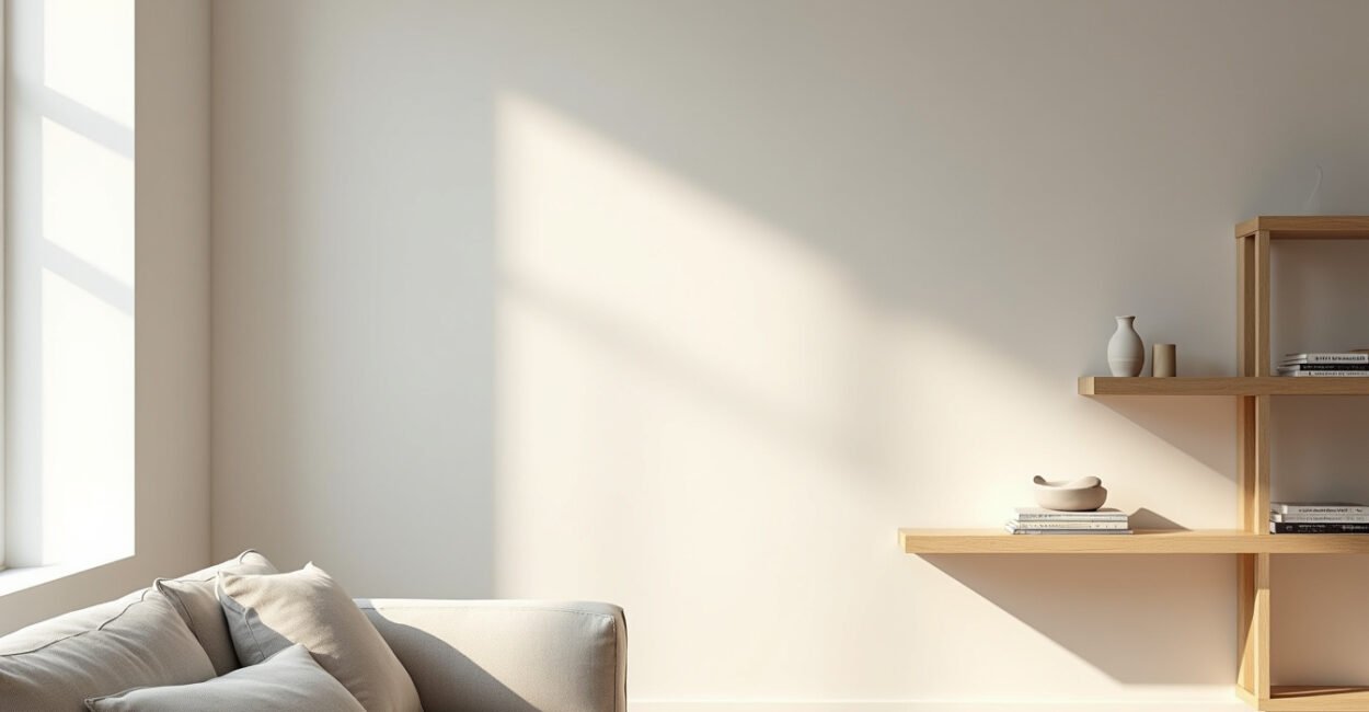
Small changes make the biggest difference when shelves feel crowded, not calm.
Minimalist Shelf Styling Tips: Create a Calm, Clean Look
Minimalist shelf styling is not about leaving shelves empty. It’s about giving every object a reason to be there. The trick is to use spacing, scale, and a few well-chosen pieces so the shelf feels intentional instead of accidental.
If your shelves look busy even after you “cleaned them up,” the problem is usually not clutter alone. It’s too many visual stops. Too many colors, too many heights, too many small objects fighting for attention. Fix that, and the whole room feels quieter.
1. Start with Negative Space, Not Objects
In minimalist shelf styling, negative space is the part that does the work. Designers use that term for the empty areas around objects, and it matters as much as the objects themselves. Without breathing room, even beautiful items look restless.
Start by removing more than you think you need. Then step back and look for one shelf that can hold just one anchor piece, while the neighboring shelf stays almost bare. That contrast creates rhythm. A shelf with two books, a vase, and a small bowl can look heavier than a shelf with one sculpture and open space on both sides.
The goal is not to fill the shelf. The goal is to let your eye rest.
One practical rule: leave at least one-third of the shelf visually open. Not mathematically perfect, just clearly open. That gap is what makes the whole arrangement feel polished instead of packed.
2. Choose Objects That Earn Their Place
Minimalist shelf styling works best when every item has a clear role: shape, texture, height, or meaning. If an object does none of those things, it is probably visual noise.
- Anchor pieces: a framed print, a ceramic vase, a stacked book
- Softening pieces: a plant, a woven box, a linen-bound book
- Texture pieces: wood, stone, matte ceramic, glass
Try this filter before putting anything back: if you removed it tomorrow, would the shelf look worse or just less crowded? If the answer is “just less crowded,” that item may not deserve a spot.
This is where people often overdo it. A shelf can hold sentiment, but not every sentimental item should sit out at once. Pick one or two pieces with real meaning and let them breathe. The rest can rotate later.

3. Balance Height, Weight, and Color Without Making It Stiff
Good shelf styling feels balanced, not symmetrical. Symmetry can work, but too much of it makes shelves look staged in a way that feels cold. A better approach is visual weight: how much attention each object pulls.
For minimalist shelf styling, mix tall with short, solid with airy, dark with light. A tall vase on one side can be balanced by a low stack of books and a small bowl on the other. The pieces do not need to match. They need to feel like they belong to the same conversation.
Think in pairs and triangles, not rows. A row looks retail. A triangle looks collected.
A useful comparison: before, the shelf may have had five small items lined up like receipts on a counter. After, it might have three objects spaced with intention, and suddenly the whole wall feels expensive. Same shelf. Very different energy.
4. Use One Texture to Warm the Room
Minimalist does not have to mean sterile. In fact, the most inviting shelves usually include one texture that softens the look. Wood grain, woven fiber, handmade ceramic, or linen-covered books can keep the arrangement from feeling too sharp.
That said, texture should support the palette, not start a new argument. If your shelf already has strong shapes and a lot of contrast, keep the texture subtle. If the room is very neutral, one tactile object can do the heavy lifting.
Minimalist shelf styling gets colder when everything is smooth, shiny, and identical.
In practice, I’ve seen the fastest improvement come from one swap: replacing a glossy decorative object with something matte and slightly imperfect. The shelf stops looking like a showroom and starts looking lived in.
For a helpful design reference, the North Carolina State University design resources often emphasize balance, contrast, and proportion as core visual principles. That same logic applies here.
5. Edit the Final Details Like a Photographer
The last 10% is what makes minimalist shelf styling feel finished. This is where you adjust spacing, align edges, and remove the one object that is almost right but not quite. The shelf should look effortless, but effort still matters.
Look at the shelf from across the room. Then look at it from a seated angle, because that is how you usually see it in real life. Are there awkward gaps? Is one side visually heavier? Is there a tiny object stealing attention for no good reason?
Here’s the edit checklist:
- Remove one object if the shelf feels crowded
- Repeat one material or color for cohesion
- Vary heights, but avoid random placement
- Keep the tallest piece from touching the shelf above
- Leave room for dusting and daily life
For a practical rule of thumb, the National Park Service design guidelines discuss how restraint and proportion guide strong visual composition. That idea holds up beautifully on shelves: fewer distractions, clearer structure, better impact.
Minimalist shelves are rarely boring when they’re done well. They feel quiet in the best way — not empty, just edited with confidence.
And that’s the real difference: a shelf can hold objects, or it can hold attention. The best minimalist shelf styling does both without trying too hard.
FAQ
How Many Items Should Be on a Minimalist Shelf?
There is no fixed number, but fewer is usually better than “just enough to be busy.” A good starting point is to style one shelf with a single anchor object, then add only what improves balance or texture. If an item does not change the shelf in a meaningful way, leave it off. Minimalist shelf styling works best when the eye can move without constantly stopping.
What Colors Work Best for Minimalist Shelves?
Muted neutrals usually make the calmest base: white, cream, beige, charcoal, soft gray, and natural wood tones. That does not mean everything must match exactly. One dark object or one warm material can make the whole arrangement feel layered without losing the clean look. The key is to avoid too many competing colors on the same shelf.
How Do I Make Shelves Look Minimal but Not Empty?
Use spacing on purpose. Instead of filling every inch, place a few items with clear gaps between them and repeat one material or color somewhere else in the room. That creates connection without clutter. A shelf can feel full of intention even when it holds only three objects, as long as each piece has visual weight and the composition feels balanced.
Can I Mix Books with Decor on Minimalist Shelves?
Yes, and books often help a shelf feel grounded. Stack them horizontally to create height changes, then pair them with one sculptural object or vase. Just avoid turning books into filler. If the stack looks accidental or too tall for the shelf, it can throw off the whole arrangement. In minimalist shelf styling, books should support the composition, not dominate it.
What is the Biggest Mistake People Make with Shelf Styling?
They add objects one by one without stepping back to assess the whole shelf. That usually leads to visual clutter, even when each item is attractive on its own. The better habit is to style in layers, then remove one piece if the arrangement starts to feel crowded. Good shelf styling is as much about editing as decorating.


