Skip to content

Painted glass jar decor styles can change a room faster than most people expect, because the finish does more than decorate—it controls light, contrast, and how intentional the styling feels. A painted jar reads as an object; a clear jar reads as a vessel. That one difference decides whether the arrangement feels cozy, airy, rustic, or modern.
If you’re choosing between painted and clear glass jars for shelf styling, tabletop decor, or centerpiece ideas, the real question is not which one is “better.” It’s which finish matches the room, the mood, and the amount of visual weight you want on display. Below, you’ll get a practical side-by-side comparison, room-by-room guidance, and styling rules that keep decorative glass jars looking curated instead of crowded.
In a Nutshell
- Painted glass jars create stronger contrast, which makes them a better fit for rustic decor, farmhouse decor, boho decor, and cozy accent styling.
- Clear glass jars are more versatile, but they only look polished when the contents are clean, repeated, or color-coordinated.
- Painted jars work best when you want the jar itself to act as decor; clear jars work best when the contents are part of the design.
- The smartest rooms for painted finishes are shelves, mantels, and side tables; the smartest rooms for clear finishes are kitchens, bathrooms, and layered centerpieces.
- Mixing both finishes in one room works when you repeat one color family and keep the shapes consistent.
What Painted Glass Jar Decor Styles Mean and Why the Finish Changes Everything
Painted glass jar decor styles refer to the way colored, frosted, distressed, matte, or opaque jar finishes shape the overall look of a space. In practical terms, the finish changes whether the jar blends into the room or stands out as a focal point. That makes finish choice a design decision, not just a craft detail.
The same jar shape can look completely different depending on whether the glass is left clear or coated in paint. Clear glass preserves light and transparency. Painted glass reduces visual noise and adds color blocking, texture, or mood. That is why a mason jar painted in chalky white can feel farmhouse, while a smoked or matte black jar can feel modern and restrained.
What separates painted jars from clear jars is not style alone—it is how much visual authority the jar is allowed to have in the room.
That difference matters in shelf styling, tabletop decor, and home decor jars more than it does in storage. A jar used for display has to earn its place. A jar used for storage just needs to stay useful.
For broader home styling ideas that reuse found objects with intention, these elevated repurposed storage ideas show the same principle in a different material: the finish affects whether an object reads as clutter or design.
Painted Glass Jars: The Look, Mood, and Best Decor Styles
Painted glass jars work best when you want the jar to look like a decorative object instead of a transparent container. They bring weight, contrast, and a sense of completion, which makes them especially effective in rooms that already contain wood, woven texture, linen, or matte finishes.
Best Matches for Painted Jars
- Farmhouse decor: Soft white, cream, and muted sage tones fit shiplap, reclaimed wood, and vintage metal accents.
- Rustic decor: Distressed paint and earthy neutrals work well with raw wood, galvanized trays, and natural greenery.
- Boho decor: Terracotta, dusty pink, mustard, and clay tones pair well with rattan, jute, and layered textiles.
- Modern decor: Matte black, charcoal, and monochrome finishes create clean contrast on open shelving.
- Minimalist decor: A single painted tone in a restrained palette can calm a busy shelf without looking empty.
Why the Mood Feels Stronger
Painted jars tend to feel more intentional because they hide visual clutter. You are not seeing labels, contents, or random color variation through the glass. Instead, you are seeing a shape, a surface, and a controlled finish. That is why painted jar styling often looks more “decorated” with less effort.
In practice, the downside shows up when the room is already dark or heavily textured. Too many painted jars can flatten the composition and make a shelf feel dense. That’s where restraint matters. One or three painted jars usually look better than a full row, unless the goal is a strong color statement.
If you are building a room around recycled or upcycled accents, this look pairs well with repurposed fabric decor, because both rely on texture, softness, and a hand-finished feel rather than polished perfection.
Painted jars work when you want the surface to carry the styling; clear jars work when you want the contents to do the work.

Clear Glass Jars: The Look, Mood, and Best Decor Styles
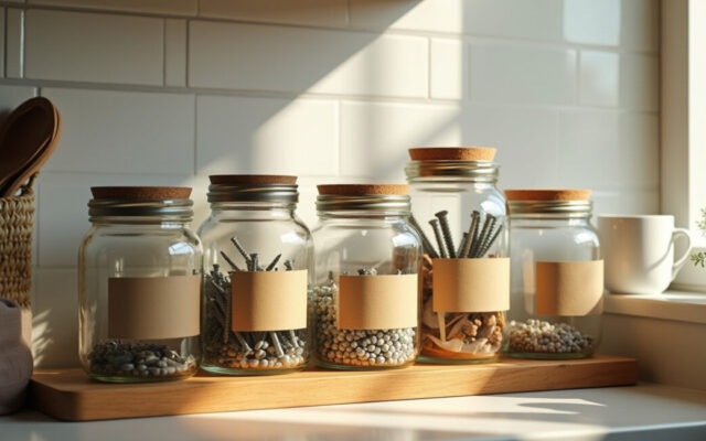
Clear glass jars are the more versatile option because they keep light moving and make the contents part of the design. They are the better choice when you want airiness, flexibility, and easy seasonal swapping. They also work well when the items inside are attractive enough to deserve attention.
Best Matches for Clear Jars
- Modern decor: Simple shapes, clean lines, and transparent surfaces keep the look light.
- Minimalist decor: Clear jars reduce visual bulk and support a quieter shelf or counter.
- Farmhouse decor: Clear glass works when filled with dried stems, cotton, bath salts, or pantry staples.
- Kitchen styling: Flour, pasta, grains, and coffee beans can become part of the display.
- Bathroom styling: Cotton rounds, bath salts, and soap bars look cleaner when visible through glass.
Why Clear Jars Stay Popular
Clear jars are forgiving. They let you change the contents without changing the container, which makes them useful for seasonal decor, hosting, and everyday shelf refreshes. A set of identical clear jars can look expensive even when the contents are simple, because repetition creates order.
The catch is that clear jars expose everything. If the contents are uneven, busy, or mismatched, the jar stops looking decorative and starts looking like storage. That’s why clear jar styling works best with consistent fills, matching lids, and a repeated shape family.
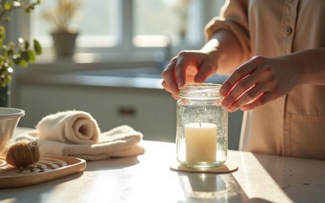
For a cleaner everyday-home approach, careful surface and container maintenance also matters, because fingerprints, residue, and cloudy glass can ruin the look fast.
Painted Vs. Clear Glass Jars: Side-by-Side Comparison Table
Here is the simplest way to decide: painted jars create mood, while clear jars create flexibility. If you want the container itself to be part of the decor, choose painted. If you want the contents to change over time, choose clear.
| Design Factor | Painted Glass Jars | Clear Glass Jars |
|---|---|---|
| Visual impact | Higher; stronger color and surface presence | Lower; more open and understated |
| Versatility | Moderate; tied to palette and room style | High; works across many rooms and themes |
| Best for | Rustic, farmhouse, boho, modern accent styling | Minimalist, modern, kitchen, bathroom, seasonal displays |
| Perceived clutter | Lower, because contents are hidden | Higher, because contents are visible |
| Light reflection | Reduced | Strong; keeps spaces brighter |
| Styling difficulty | Easier to make look finished | Requires cleaner contents and better coordination |
That comparison aligns with basic interior-design principles around visual balance and light. The National Park Service’s guidance on light and color explains why surface color changes the way a space reads, and the same logic applies to jars on shelves and tables.
Best Rooms and Styling Uses for Each Jar Finish
The room matters as much as the jar finish. A painted jar that looks perfect on a mantel can feel too heavy in a tiny bathroom. A clear jar that shines in a kitchen can look unfinished on a dark entry console.
Where Painted Jars Usually Win
- Living room shelves: They anchor books, frames, and other loose objects.
- Entryway consoles: They create a first impression without needing much filler.
- Fireplace mantels: The finish stands out against stone, brick, or wood.
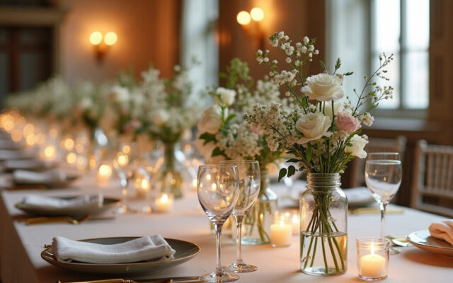
- Dining table centerpieces: They add structure and help define a theme.
Where Clear Jars Usually Win
- Kitchens: They suit dry goods, utensils, and pantry organization.
- Bathrooms: They keep small items visible and neat.
- Open shelving: They lighten the look of a busy wall.
- Seasonal displays: They make it easy to switch from shells to pinecones to ornaments.
A useful rule: if the room already has strong texture, go with clear glass to avoid visual overload. If the room feels plain or unfinished, painted jars can add the missing layer. I have seen this play out most often in small apartments, where one painted cluster can make a sideboard feel designed instead of random.
For rooms where you want to keep the styling lean, the repurposed-vs-new tradeoff is worth thinking through, because a curated mix of existing pieces often looks more cohesive than a shelf full of newly bought decor.
How to Choose the Right Jar Finish for Your Space
Choose painted glass jars when the room needs mood, structure, or color control. Choose clear glass jars when you want flexibility, brightness, or a display that changes with the season. If you want the most practical answer, match the jar to the job: decorative first, or functional first.
Use This Fast Decision Rule
- Pick painted if the jar is meant to disappear into a palette or become a strong accent.
- Pick clear if the jar will hold attractive items you want to show off.
- Mix both if the room needs rhythm, but keep one common element like shape, lid finish, or color family.
One nuance matters here: painted finishes are not always the better choice for “decorative” use. In a bright, modern room, too many opaque jars can look heavy. In the same room, one clear jar with a clean stem arrangement may feel more refined. So the right answer depends on contrast, not just style labels.
For a more sustainable styling mindset, eco-friendly repurposed decor projects reinforce the same idea: the best object is the one that already fits the room’s visual logic.
Styling Tips to Make Glass Jars Feel Intentional, Not Cluttered
The biggest mistake with decorative glass jars is treating them like fill-in pieces. A jar should either repeat a visual cue or create one. If it does neither, it turns into shelf noise.
Five Rules That Keep the Look Tight
- Repeat a shape: Round with round, tall with tall, short with short.
- Limit the palette: Two or three colors are usually enough.
- Vary height on purpose: Use one tall jar, one medium jar, and one low object to avoid a flat line.
- Use negative space: Empty space makes jars look curated.
- Match the room’s finish language: Matte jars suit soft textures; clear jars suit crisp, bright spaces.
A simple example: on a console table, three painted jars in muted cream, warm gray, and sage can look polished if they sit beside a framed print and a small lamp. Put six jars there, and the whole surface starts to feel crowded. The lesson is not “fewer is always better.” The lesson is that repetition has to look deliberate.
If your styling leans toward soft materials and layered texture, pairing jars with repurposed fabric accents can help the display feel warmer and more lived-in without adding more visual clutter.
Clear jars fail when the contents look accidental; painted jars fail when the palette has no restraint.
There is one limit worth admitting: no finish saves bad composition. If the spacing is awkward, the colors clash, or the scale is off, even the best jar choice will look forced. The finish helps, but it does not replace proportion.
When to Choose Painted, Clear, or Both
Choose painted glass jars when you want a room to feel calmer, more grounded, or more styled with less visible effort. Choose clear glass jars when you want adaptability, light, and a display that can change with what you already own. Choose both when you want contrast: painted for structure, clear for air.
That mixed approach is often the strongest. A pair of painted jars can anchor a shelf, while one clear jar beside them keeps the arrangement from becoming too heavy. The key is to make the mix feel planned, not accidental. Use the same lid finish, the same height family, or the same tone family so the grouping reads as one thought.
For homeowners who prefer practical decorating over buying more stuff, that is usually the smartest path: build one repeatable jar system and let the finish do the work. Then test it on a shelf, a tray, or a centerpiece before adding anything else.
FAQ
Which Looks Better in Home Decor: Painted Glass Jars or Clear Glass Jars?
Neither finish wins in every room. Painted glass jars look better when you want the jar itself to function as decor, especially in rustic, farmhouse, or boho spaces. Clear glass jars look better when light, simplicity, and flexibility matter more. The stronger choice depends on whether the room needs visual weight or visual openness.
What Decor Styles Work Best with Painted Glass Jars?
Painted glass jars fit rustic decor, farmhouse decor, boho decor, and some modern interiors very well. They also work in minimalist spaces when the palette is restrained and the shapes are simple. The finish helps them blend into wood, linen, rattan, and matte surfaces. If the room already has a lot of color and texture, use fewer painted jars so the display stays balanced.
Are Clear Glass Jars More Versatile Than Painted Ones?
Yes, clear glass jars are generally more versatile because they adapt to more rooms, seasons, and contents. They can hold pantry staples, bath items, stems, or decorative fillers without needing a finish change. The tradeoff is that they demand more visual order. If the contents are messy or mismatched, the jar stops looking decorative and starts looking purely functional.
How Do I Style Painted Glass Jars Without Making the Space Feel Heavy?
Keep the palette narrow and the grouping small. Two or three painted jars are usually enough unless you are creating a strong statement on a large surface. Pair them with lighter materials such as glass, linen, or open wood to break up the weight. If the room is already dark, choose softer matte colors instead of deep opaque tones.
Can I Mix Painted and Clear Glass Jars in the Same Room?
Yes, and it often looks better than using only one finish. The trick is to repeat one shared element, such as jar height, lid material, or color family, so the mix feels intentional. Painted jars can provide structure while clear jars keep the display airy. That balance works especially well on shelves, trays, and layered centerpieces where the eye needs both anchor points and breathing room.